Hi,
I recently got the asset and I'm pretty happy with it in general.
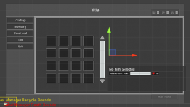
I followed the documentation instructions for setting up the asset, but the UI for main menu looks like it is not the right size or scale.

For example, the description here is poking out of the MainMenu.CenterPanel
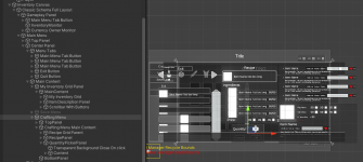
When I added the Crafting tab in the Main Menu (or Shopping) the resultant UI is even more weirdly-sized.

The main UI Designer steps I took :
1) Spawn the Classic schema in my scene. This is parented to InventoryCanvas
2) Go crafting tab, spawn the Crafting tab in MainMenu :
Parent Transform = Main Content
Panel Option = Main Menu

3) I hit create and I get the weirdly sized contents.
Navigating with the main menu tabs generally still work fine, so the crafting UI can be closed or hidden when playing the game.
Any ideas would be appreciated.
Thanks.
[Edit: adding the equipment tab under main menu worked perfectly, so the problem might lie with something in the crafting/shopping UI setup]
I recently got the asset and I'm pretty happy with it in general.
I followed the documentation instructions for setting up the asset, but the UI for main menu looks like it is not the right size or scale.

For example, the description here is poking out of the MainMenu.CenterPanel
When I added the Crafting tab in the Main Menu (or Shopping) the resultant UI is even more weirdly-sized.

The main UI Designer steps I took :
1) Spawn the Classic schema in my scene. This is parented to InventoryCanvas
2) Go crafting tab, spawn the Crafting tab in MainMenu :
Parent Transform = Main Content
Panel Option = Main Menu

3) I hit create and I get the weirdly sized contents.
Navigating with the main menu tabs generally still work fine, so the crafting UI can be closed or hidden when playing the game.
Any ideas would be appreciated.
Thanks.
[Edit: adding the equipment tab under main menu worked perfectly, so the problem might lie with something in the crafting/shopping UI setup]
Last edited: